Beattie’s Vodka
LABEL DESIGN
MAIN SCOPE / GLOBAL REBRANDING
MAIN SCOPE / GLOBAL REBRANDING
↑

CREDIT / LEAD DESIGNER AT OSTRICHCO
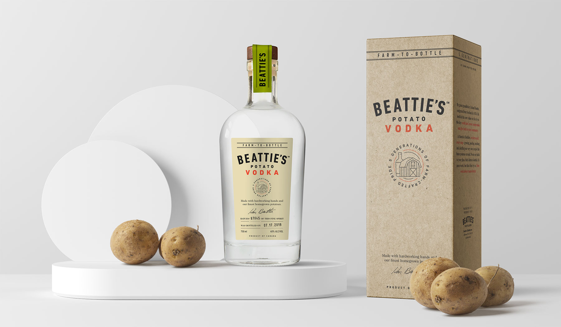
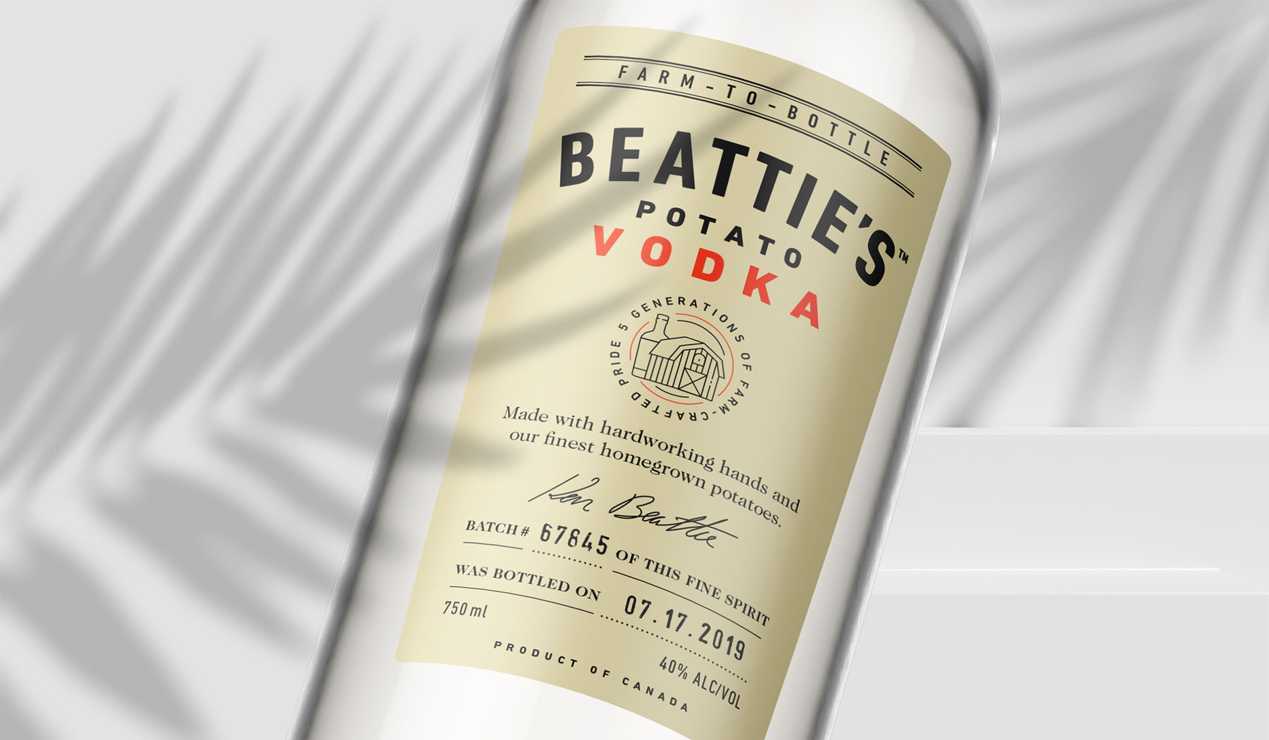
THE CHALLENGE WHEN CRAFTING THIS LABEL WAS TO SUBTRACT RATHER THAN ADD WHILE PRESERVING THE ESSENTIALS. THIS MEANT RESTRUCTURING THE MULTI-LAYERED MESSAGING IN ORDER TO FIND THE DESIRED BALANCE.
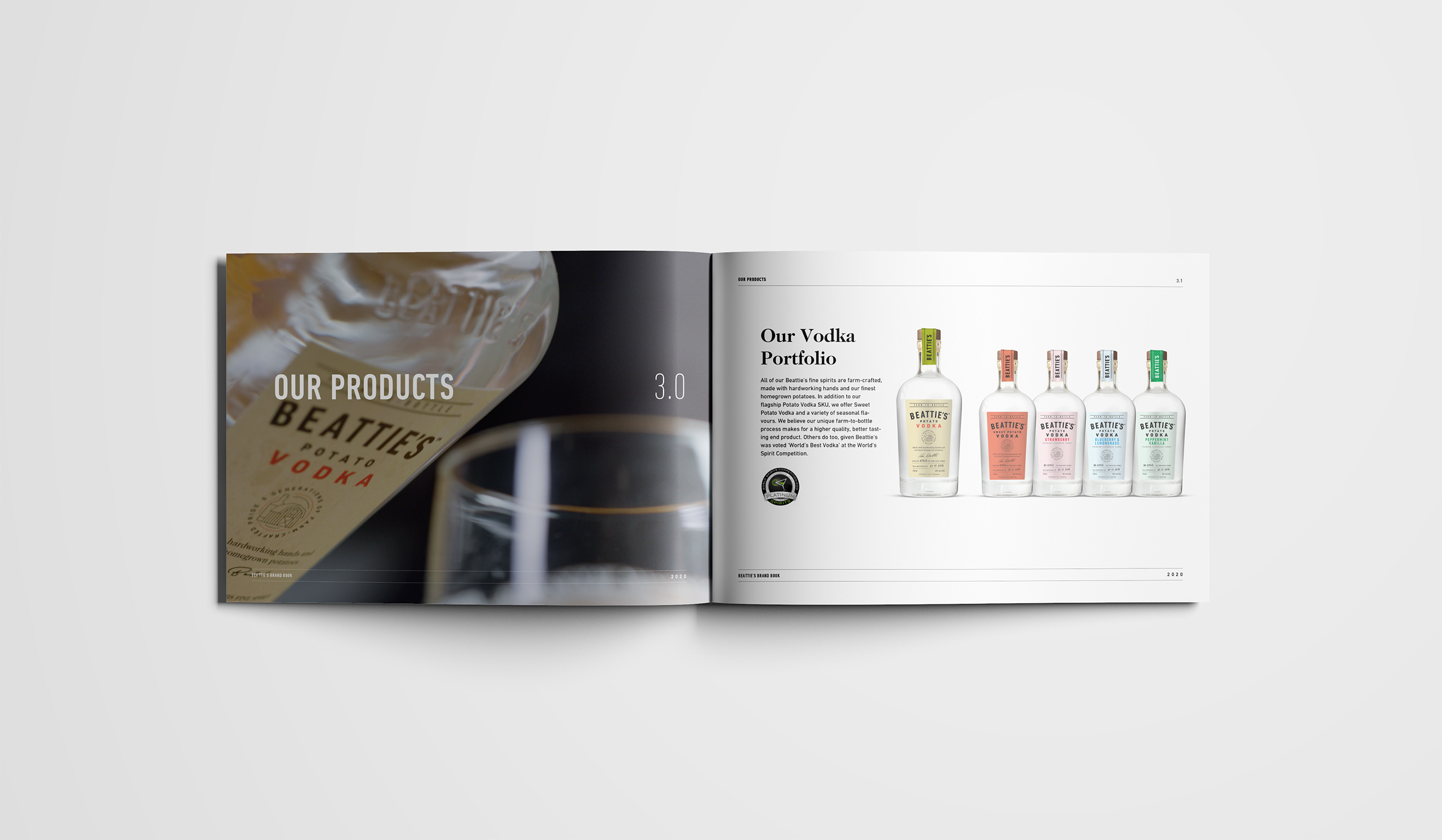
Beattie’s is a Premium Farm-To-Bottle Vodka made by a family of farm-crafters dating back 5 generations. Even though their Potato Vodka is said to be one of the best around, their product’s success was stalling and in dire need of a brand refresh.
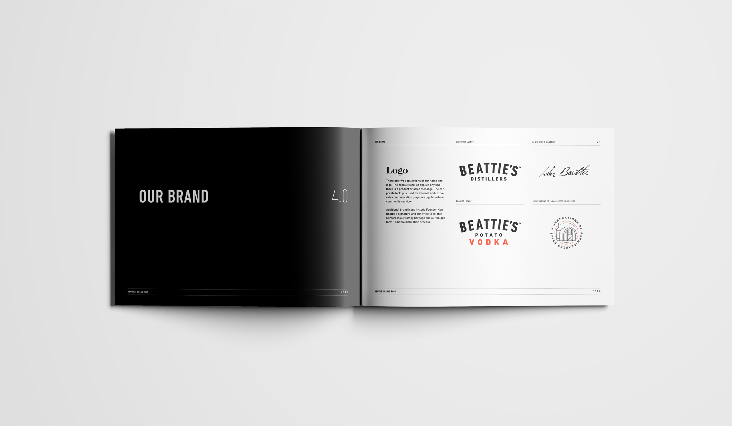
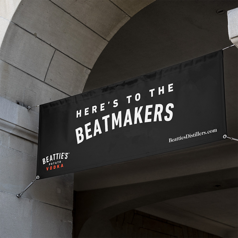
As former Designer at OstrichCo, FUNctionalTM founder Bogdan Truta helped lead the creation of a new brand identity based on existing assets and developed a new label design that would easily fit into Beattie’s extended product line. Additional assets such as a design system, brand guidelines, collateral and promotional items were commissioned in order to fully update Beattie’s brand image.
As former Designer at OstrichCo, FUNctionalTM founder Bogdan Truta helped lead the creation of a new brand identity based on existing assets and developed a new label design that would easily fit into Beattie’s extended product line. Additional assets such as a design system, brand guidelines, collateral and promotional items were commissioned in order to fully update Beattie’s brand image.


